Business Card:

Why did you pick the product you did?

 I decided to use a syrup bottle because when I was looking for ideas of labels to redo, I saw the syrup bottle and thought that it would be a fun label to redo. I liked the fact that the back label had all of the important information, and the front was clean and simple. I also thought it would be fun to make a design that wasn't the usual square or rectangle shape.
How did you design your piece? Tell me your process.
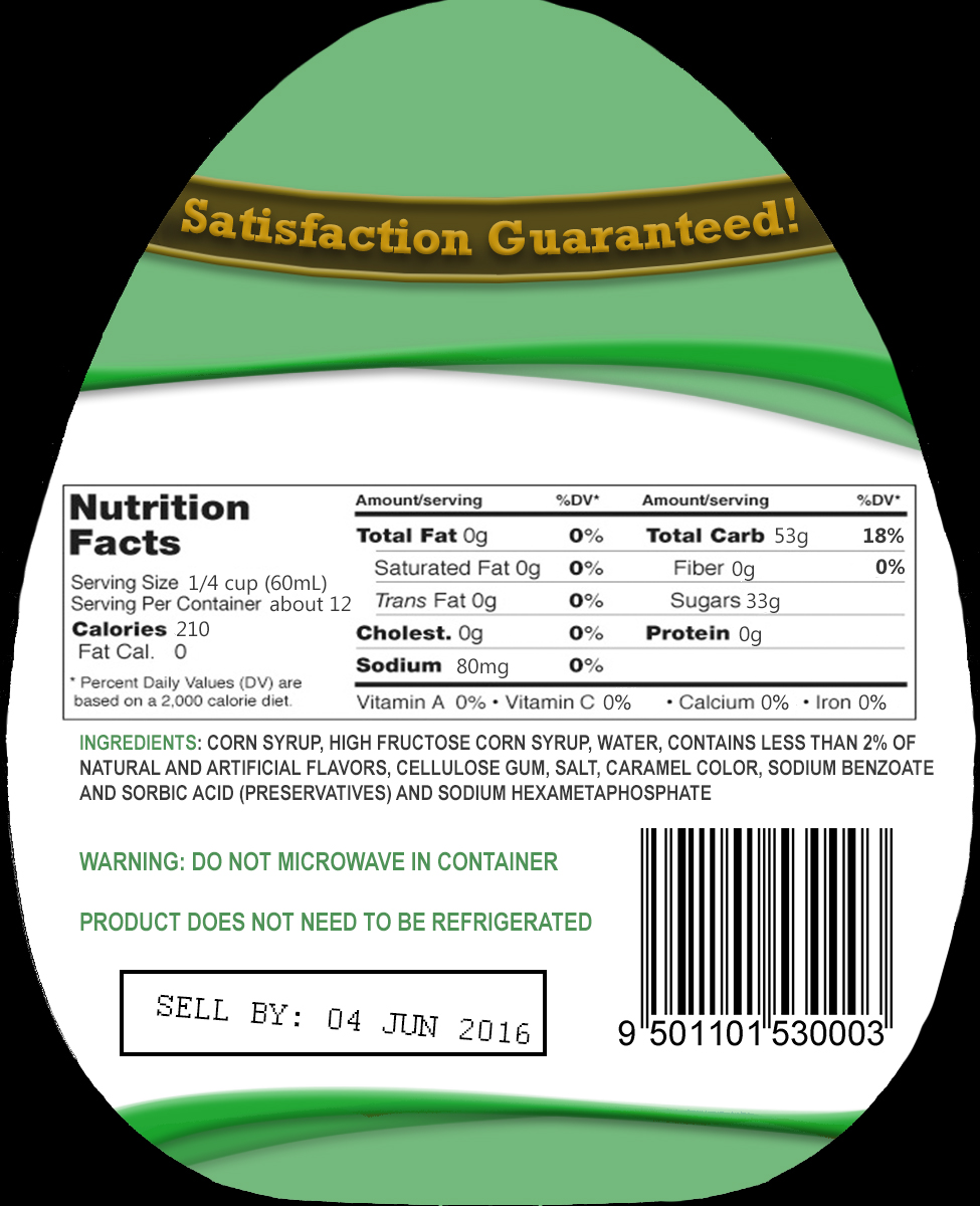 The main design of this piece is thanks to the mini lesson when we had to make a brush. I still had the wave brush I used in that project, and thought it would look good on the label. I first framed off the middle section and added some images to fill in most of the space. I liked the look of the dripping syrup off the spoon, but it needed a background. I used a picture of pancakes that I blurred and put behind the spoon. then I selected part of the syrup and made it slightly transparent to make the images blend together better. Next I needed the title of the product. I decided not to use a brand because I thought it would make the piece look cluttered, so I just made banners that said "Maple" and "Syrup." I made these banners by selecting two boxes around the text on a blank layer, and filling them in with color. Then I used the warp tool to get the bend that I wanted. After that, I changed the Layer Styles to add bevel and shadows. Then I made another blank layer underneath where I filled in the space between the banner borders, and used the burn tool on the bottom half of the banner to make it look like it had a shadow.
What is most successful about your design?

If you could change anything about the piece, what would you do and why?
I don't really know what I would change about this piece. I feel like it needs something, but don't know what it is. Parts of the label, like the top of the back side, look kind of bare, but I don't know what I should add to fix that. overall, I am happy with the way this turned out.
No comments:
Post a Comment